simardcasanova’s avatarsimardcasanova’s Twitter Archive—№ 34,421

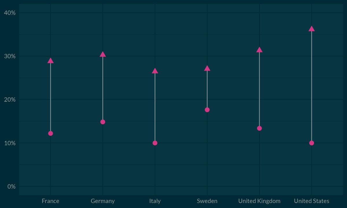
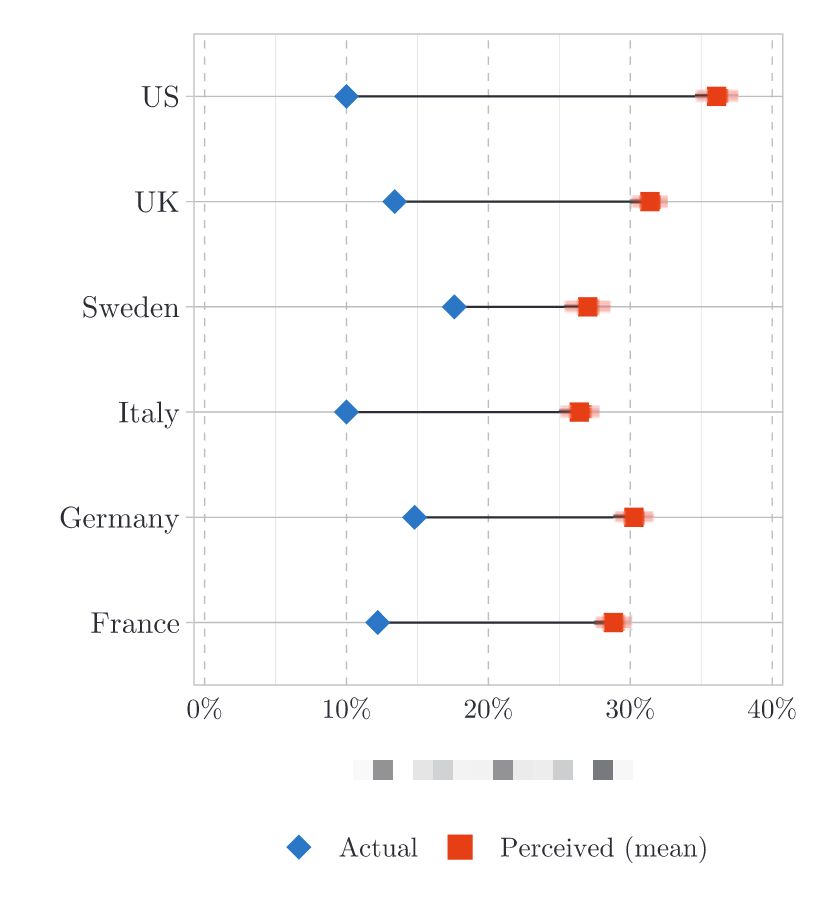
  1. Are you up for a little quizz? The blue diamonds are the actual data, and the red squares are the perceived data But what data is it?
    oh my god twitter doesn’t include alt text from images in their API
    1. …in reply to @simardcasanova
      So the answer is: it’s the share of immigrants within the population Next week, I’ll publish a popularization article about an econ paper that investigates a possible fix for this informational discrepancy Don’t miss it by subscribing to my newsletter: skepticalecon.wordpress.com/
      1. …in reply to @simardcasanova
        And because I’m a data nerd, here's my own version of the plot (designed with #Rstats):
        oh my god twitter doesn’t include alt text from images in their API