-
@tomwestland I dunno. I legit wonder if he didn’t draw the regression line by hand. And if he didn’t, I’m pretty sure that if you remove the outlier on the y axis, his regression line would basically be a horizontal linePermalink
 Mood +1 🙂
-
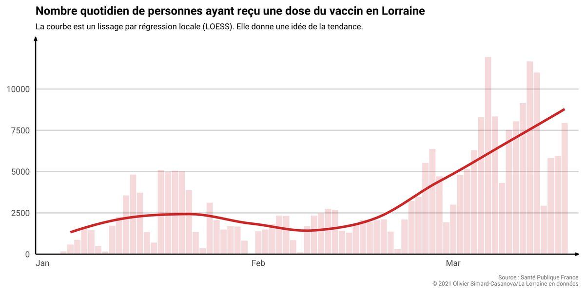
@tomwestland Also: don’t use the same unfaded color for your raw data and your regression, especially with a dashed line. His plot is kinda hard to decipher. I prefer my approach much more covid.oscncy.fr/vaccination-lorraine.html
 Mood -1 🙁