-
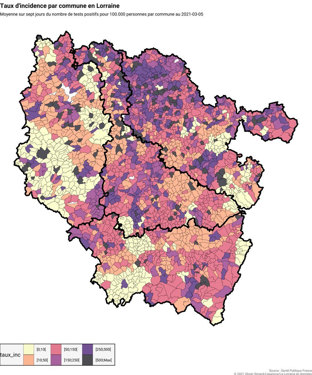
@AdvikSh You can be that guy! But the reason why I use this specific color palette is because it’s tied to the color system used by the French government to measure the severity of incidence rates (explained here in French: covid.oscncy.fr/taux-incidence-doc.html)Permalink
 ❤️ 1 Favorite
Mood 0
❤️ 1 Favorite
Mood 0
-
@AdvikSh I know there are drawbacks here but I want the map to stay consistent with the color code used everywhere on the dashboard! Also, most of the time I also display “raw” data on top of colored items, so people can still access them (even if it’s not that convenient)Permalink
Mood +3 🙂
-
@AdvikSh I’m also not sure if it’s possible to have thresholds with viridis?Permalink
Mood 0
-
@AdvikSh Problem solved, thanks for the suggestion! The dashboard will actually feature the two maps (in two different tabs), so there’s no need to choose only one color scale!
 Mood 0