-
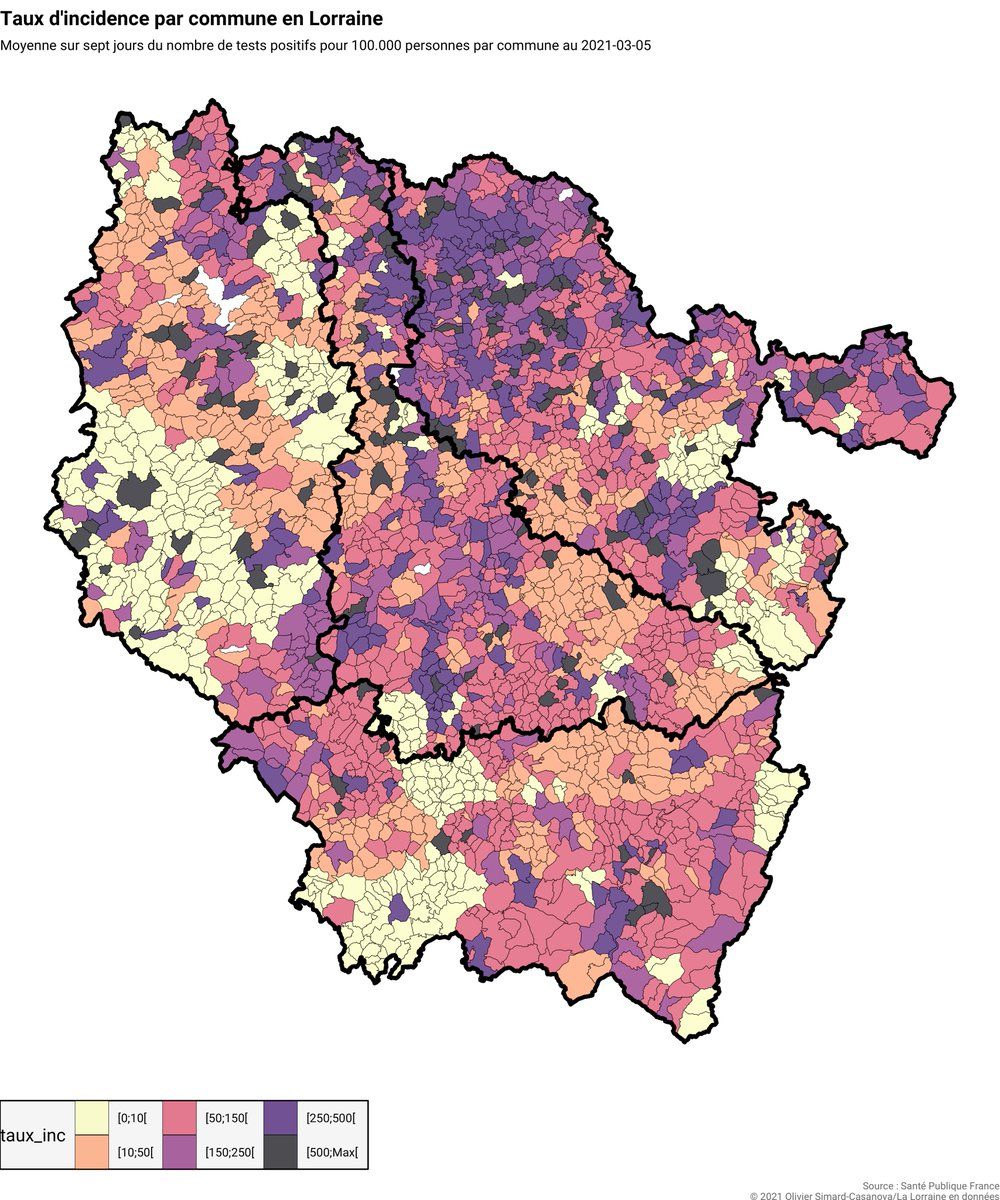
@AdvikSh You can be that guy! But the reason why I use this specific color palette is because it’s tied to the color system used by the French government to measure the severity of incidence rates (explained here in French: covid.oscncy.fr/taux-incidence-doc.html)
 ❤️ 1 Favorite
Mood 0
❤️ 1 Favorite
Mood 0