-
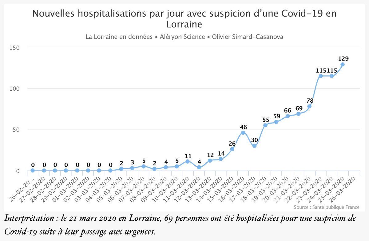
The wave of coronavirus patients overflowing the French ER/hospitals is still gaining in intensity (data: number of ER admissions/day due to suspicion of Covid-19 in my region of Lorraine) The peak is expected this weekend But it's not spatially uniform Mini-thread 1/ t.co/SY6i20GIIHPermalink
 ♻️ 1 Retweets
Mood +2 🙂
♻️ 1 Retweets
Mood +2 🙂
-
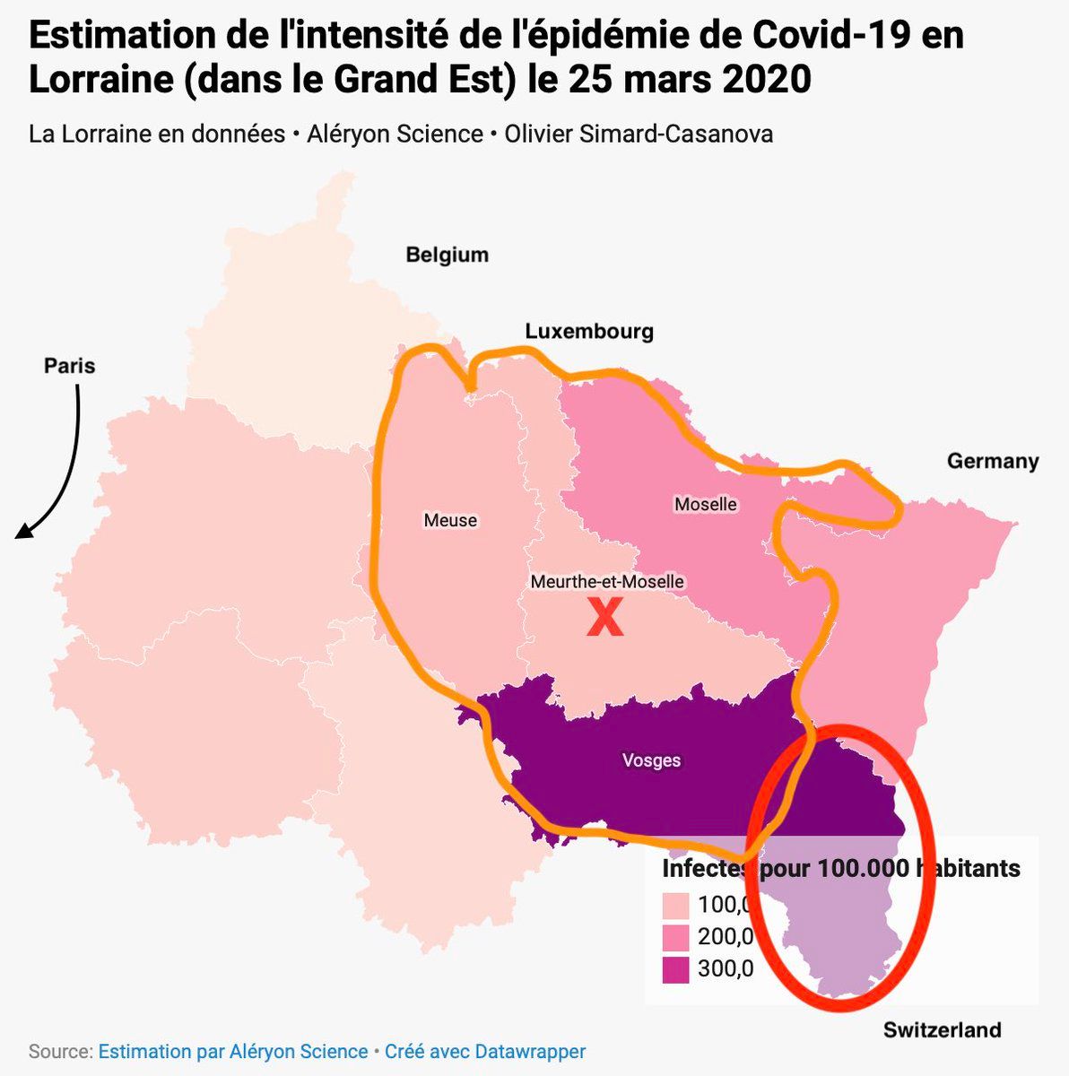
There is a significant heterogeneity on *where* the wave is intense: some areas are hit much harder than others This map (I made) of North-Eastern France clearly shows huge spatial disparities (# of infected per 100.000 inhab.) 2/
 Mood +2 🙂
-
Legend of the map: - red elliptical: epicenter of the French epidemic (Mulhouse) - red cross: where I live - orange line: the Lorraine region The map features estimations I made on the number of infected people, estimations extrapolated from actual data 3/Permalink
Mood -2 🙁
-
The département were I live is clearly not hit as hard as some other areas, especially the Vosges Why? My current hypothesis is: the epidemic wasn't there yet when the quarantine was announced, and because of that the quarantine basically "killed" the epidemic there 4/Permalink
Mood -3 🙁
-
Of course, it's just an hypothesis, it will need further investigation What I wanted to emphasize with this mini-thread is: epidemic are spatially distributed *within countries*, not just *among countries* FIN. And take care. 5/Permalink
Mood +2 🙂
-
If you want to explore those local data (in French), you can have a look at the dashboard I am publishing about the epidemic in my region: lorraine.aleryon.science/donnees/covid-19/Permalink
Mood +1 🙂